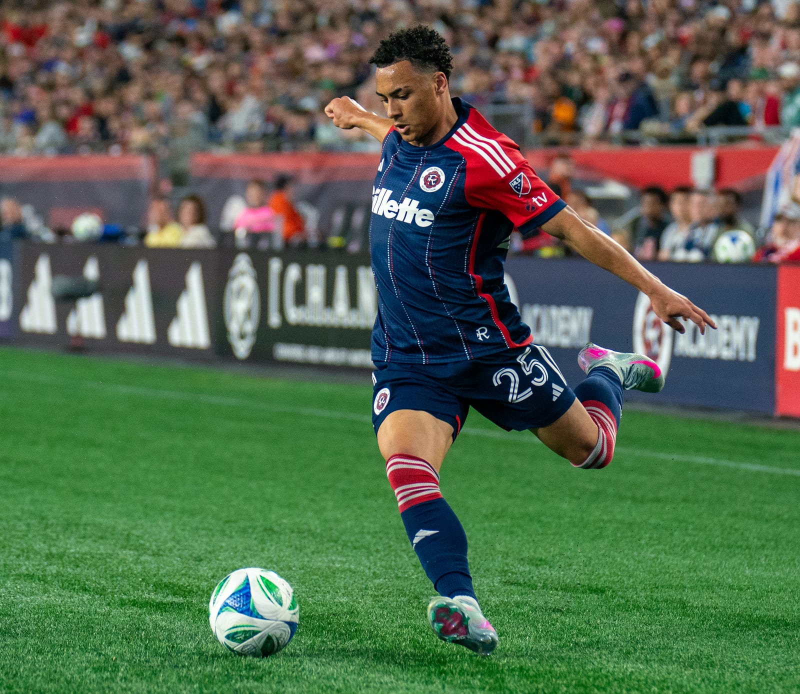
Thursday marked as important a moment in New England Revolution history as clinching the club’s first Supporter’s Shield like two weeks ago. The Revs being the last of the original 1996 MLS teams to update their logo and branding, are looking to capitalize on the success of the Bruce Arena era on the field and the recent additions of a state-of-the-art training center for the organization as a whole.
The following post will not be indicative of the recent efforts of the front office, in particular Cathal Conlon and his Marketing and Community Relations team. Cathal and his group, Willy, Kurtis, and others on the social media side, as well as Team President Brian Bilello deserve a lot of credit and praise for overseeing not just the rebrand process but their coverage and dedication to the team as a whole given the circumstances over the last couple of years with the pandemic and with the success of the 2021 season in particular. The magnitude of this project and the effort that went into it should not be overlooked despite how critical I am about to be on Thursday’s launch. My disappointment this time does not only lie with the impending departure of my beloved Crayon Flag.
Let’s start with what went right about the Revolution’s rebrand, beginning with the team hype video. Yes, I too will run through a wall for all of Kurtis Burke’s usual hype masterpieces. I concede graciously the fact that the “Proudly Not Another FC” tagline is quite frankly brilliant, and the decision based on fan feedback regarding keeping the Revolution name unchanged while seemingly obvious to hardcore fans, is a clear indication of the homework that went into this rebrand process. There’s also a solid selection of secondary branding logos.
This is where the compliments sadly end, as these brief positives are only reinforced by a large flag hung from the Boston Harbor Hotel and some standard merchandise boxes for a few Patriots players and local media. As someone who spent 12 years working with a mostly broke independent baseball team in Bridgeport, CT, I understand the difficulties of promotion and marketing on a budget. That was the old Revolution, the new Shield winning Revolution are supposed to be new and improved and not the same after 26 years.
A three-year rebranding process should have a bigger headlining event than a single large flag. You’re at Boston Harbor proudly stating your refusal to accept an “FC” or “SC” or “City” moniker like the rest of the league has seemingly done the last few years. Put some New York City FC logos on some crates marked Manhattan Claw Chowder and invite people to start chucking them into the harbor and have a party.
Dump some crates “full” of FC Cincinnati chili (I admit I like the combo of chili and diner spaghetti, but we have a brand to uphold here), the bad Chicago Fire FC logo that absolutely belongs at the bottom of a harbor in Lake Michigan... Columbus SC hard hats, Nashville SC guitar picks, Sporting KC wizard hats, New Jersey energy drinks and claimed Seattle inventions all where they belong – in the harbor with the tea. Imagine the lasting impact of that for years to come.
That is how you properly celebrate a rebellion in Boston or so I thought. Also, this would be a great goal celebration for next year, this one’s on the house Revs, please, this would be awesome, maybe set up a little pool/mock harbor somewhere near The Fort to drop the “crates” into.
The merchandise offered doesn’t go far enough to reinforce the new branding. The Bring the Fight tagline is good, the Proudly Not Another FC line is great, and needed to be on a shirt or three. It’s 50 degrees outside or colder right now and I don’t see any hoodies with the new logo at the Pro Shop. I believe there are some available online now but it seems impossible to not have generic plain navy/red/gray/etc. sweatshirts en mass on day one. The strike-through sash is unique, getting slightly thinner in the middle with indentations at the top and bottom and should be featured prominently on something, anything, and I don’t see it.
The staggering lack of current merchandise throughout the year was also puzzling, and there still seems to be a significant demand among the fanbase for what will be the old logo. Pat the Patriot items are still sold so why not the Crayon Flag too? The rebrand doesn’t have to nor should it be the death kneel of the last original ‘96 logo. I understand heavily prioritizing the new merch but that shouldn’t completely end the production and sale of the old things either but the lack of restocking this year all around bothered me as the endgame of the rebrand became clearer.
Sadly, the biggest letdown is a lack of new jerseys. I understand the league tradition or rule is to have these things launch in the spring, but to not have new kits to at least pre-order for perhaps the holiday season has always an abject failure in a normal year but doubly so for a team that hasn’t had jerseys for a Shield winning team all season and just rebranded.
There’s been almost no recent Tajon Buchanan shirts to celebrate his breakout year with Canada, not nearly enough Carles Gil jerseys for a likely MVP winner, Adam Buksa and Gustavo Bou have more goals on the year than adult jerseys with their names on the back in stock currently. I’m sure a few hundred Matt Turner goalkeeper shirts of various colors would have flown off the shelves the past few weeks if there were any around to sell. It’s not like he was called up for the United States National Team again or anything yesterday.
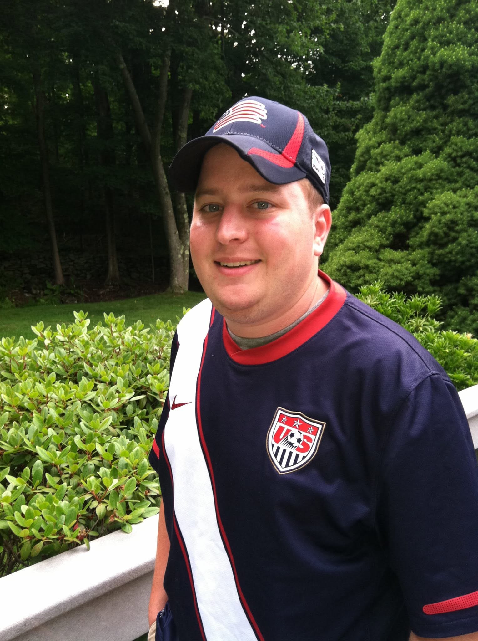
Ben Saufley has these designs up already and they’re straight fire. The 2010 USMNT sash kits are the best I admit another one of my biases, but I can’t conceive a way I would launch a rebrand or new logo without your most important piece of merchandise that hasn’t been available for most of the year.
If Ben can have a solid work up on three new sash kits (there’s a green pine tree version in his feed as well that I like as well) that include one of the secondary logos, I’m pretty sure an MLS team should have kits ready to at least pre-order on rebrand launch day. I understand that there’s a pandemic and international shipping and supply chains are a mess, but there’s been years of planning for this event. If the same amount of time goes into developing and researching a new brand as it does into designing and producing jerseys, not having both processes synced up for the big day seems unconscionable.
If the league or Adidas aren’t able or willing to move up or adjust their preferred timetable to reflect the importance of this moment and produce two new jerseys for the rebrand, then I be pushing for a different apparel deal as soon as possible. A coordinated jersey launch week might be good for the league but it is directly unhelpful to the Revs right now and I wouldn’t accept that. Nor would I have planned for or accepted producing only one jersey next year for the brand I’m going to likely have the next several decades.
I am struggling to put together the solid logic of trying to capitalize on a Shield winning campaign as early as possibly and yet attempting to do so with seemingly so little to help the Revs drive home the rebrand in the early stages. Not having two new jerseys next year seems like egregious misstep and combined with no jersey stock this year it’s a massive lost opportunity for a season which the team has had more marketable stars than at any point in it’s history.
The time of the Revolution sitting back idly as the league passes them by is over, and the time to lead from the front and set the tone for the league as often as possible has already begun. But the impact the rebranding should’ve had has already been squandered. ESPN didn’t write an article on it, only a clip of one of the Patriots players wearing new gear is on the team home page as of yesterday. The front page of MLSSoccer.com moved on from the story within hours, and despite some great features at The Athletic and Sports Illustrated and local coverage...there wasn’t anything lasting that I saw outside of the diehards.
I love the Crayon Flag. It represented a long journey and struggle of a new team that largely punched above its weight before having a decade of misery save for the 2014 MLS Cup run in the second half of its existence. There is history and usually agony associated with that logo that will never fade away for most supporters and it has a chance be forever associated with one of the best teams in league history in its final season. I hold no such love for the new badge artistically, at best I think it’s fine, but there’s enough here to build on going forward. However, my first impressions from the original leak to Thursday’s official debut are between somewhat lacking at best and grossly underwhelming to forgettable at worst.
What the club needed was to hit a home run on it’s launch day and it struck out. The team gets another shot on Sunday in front of the biggest crowd and with the Supporter’s Shield in attendance to impress.
I refuse to let the Strikethrough Ghostbuster R Sash, or whatever we might end up calling this thing, to begin its life cycle with the team the same way the Crayon Flag spent most of its time – as an afterthought.
I refuse to accept the low standard and overall meager support from an organization set under the years of the Crayon Flag for this new badge whose launch day seems more appropriate for a broke independent baseball team than the MLS Supporter’s Shield holders.
Guys meet me at the graveyard in 10 minutes we're going to get drunk on box wine and tell stories about Steve Ralston & Joe Max-Moore & Matt Reis & burn some white sage & also a Jay Heaps jersey and then we're going to take the ashes and sprinkle them on Bruce Arena for good luck
— Pablo Iglesias Maurer (@MLSist) November 4, 2021
The players who wore the Crayon Flag over the years largely deserved better, the fans that bought it at their older brother the Patriots Pro Shop absolutely deserved better, and the staff that toiled here for the first 25 years trying to promote a losing team for half of it without question deserve to never be in that situation again. Yet despite all of that, this team still managed to produce a lot of wins, success, and great memories along the way despite often getting the same support the first team got during the early designated player era, which was not enough. Not nearly enough. And it’s a shame it took so long for this season to happen because it very clearly could’ve happened years ago.
Finally, it was long foretold that any rebrand from the team would only have coincided with a new stadium. I am too far removed from the Boston area for this to affect me as what’s another half hour on a three hour drive. An SSS would’ve always been the final step in the evolution of the Revs rebirth that has come so far over the last few years, I don’t have an issue with a rebrand starting before the new building. Yes, it is technically a broken promise of sorts, but the intent and financial investment shown recently perhaps is the momentum needed to finally begin a ground that the Revs can call their own.
The Crayon Flag should’ve won its first league trophy long before a few short weeks ago. It shouldn’t represent the heartbreak and mediocrity that far too many seem to associate it with, especially the recent years before Bruce. This team and organization deserve a rebrand that reflects the effort and undertaking of the last few years which are overwhelmingly positive and long overdue – building a new training center, getting their developmental team off the ground, and a first team playing squad full of talent that is at the top of the league.
This organization also deserves the organizational commitment shown specifically under Bruce Arena, who was able to take the long-standing foundation of draft picks, players acquired via trade, and league veterans that have been a staple in New England, combine them with great international signings, and finally hoist a trophy. The people in and around this team can finally be a part of an organization where every day is the Super Bowl SuperLiga final rather than living in the literal shadows of an organization who holds those virtues high.
I disagree with the timing and execution of Thursday’s events, not the eventuality that was the end of the Crayon Flag. While I would have officially announced this after the playoffs, Seth Macomber is right, the time to capitalize on a rebrand is right now amidst what is possibly the best season in team history. I wish I could see Cathal, Brian Bilello, and Kyle Lindsay among others in person this weekend to thank them for their efforts this year and with the rebrand and celebrate in the tailgate lot a tremendous season on and off the field regardless of my personal opinions of the rebranding launch.
This organization from top to bottom deserves praise for the growth and accomplishments and a brand that reflects that and I’m sure there are bigger and better things on the horizon. I wish Thursday was a far more memorable and impactful day in Revs history. I hope and think tomorrow will be.
Alas, a medical appointment for some routine bloodwork will keep me in Connecticut this weekend as a proud member of the couch brigade. I’m going to be told that my cholesterol is too high, and I should eat less at work at four in the morning... normal stuff. I doubt the test results will notice I have a bit of a broken heart right now. Which I believe the only cure is an prescription of more silverware.
In the immortal words of Jake Taylor: There’s only one thing left to do...win the whole. Freaking. Thing.
All that’s left to do is send the Crayon Flag off into the sunset...while it hangs up in the rafters hopefully with two new banners in Gillette and trophies to match.
Long Live the Crayon Flag


